The graphics on the BRE Datsuns are legendary, and often copied as Nissan has with their new 50th anniversary 370Z that uses the BRE stripes and contrasting top and side colors. How did you come up with the design?

First, I knew I wanted to make the cars patriotic to America.  In the ‘60s it had only been 20 years since WWII ended and there was still some sensitivity to the Japanese, especially on the West coast. I wanted to make sure the cars came across as loyal to America so went with the red, white and blue paint scheme.

Next, I wanted to make the graphics bold.  Keep in mind a race car will only be seen for a few seconds at a time and spectators are a distance away so you want major impact. I would stripe off a car with tape and walk across the street to see if the size of the stripes, overhang of the color over the sides and numbers were easy to identify.

Then I wanted to make the cars look more streamline.  I did this by bringing the top color over the sides of the car a couple of inches and painting the rocker panels at the bottom of the cars black.  A person looking at the cars would see the “sides” of the car as the white painted portion and these techniques made the car look more sleek.

BRE 240Z #3

BRE 510 #85I also wanted the cars to look fast and that’s where the angled side stripes came in. They not only gave the cars the impression of speed, but being the reverse angle of the windscreen they gave the impression of an arrow from a distance.  A person doesn’t consciously notice any of these details but the overall impression is impactful.

yellow tail pipe Being a factory-based team, marketing coverage was important. Every aspect of the car needed to photograph well. That’s why I had the entire exhaust system, which was a work of art, painted bright yellow and the inside of the engine compartment painted white so all details of these great cars the BRE team built could be clearly seen and appreciated.

Speaking of the car photographing well, the cars needed to stand out from the track so I had a rim of white painted along the outside edge of the front spoilers. This made the front spoiler pop out from the black asphalt of a track. spook with white outline


If someone doesn’t want to copy the BRE graphics, what guidelines would you offer them?


•  Decide on the purpose of the graphics. Is it to enhance the design of the car (as it was with BRE as we were promoting the cars for Datsun/Nissan) or is it to be a signboard (e.g. promoting a sponsor) where the graphics are unrelated to the car. Decide which and stick to it.

•  No matter what the purpose, you want the car to photograph well for social media, articles, etc. Don’t make the common mistake of designing the graphics standing next to the car. I’ve seen graphics that are really beautiful when you’re three feet from the car (e.g. waving flag) that spectators, tv cameras, etc can’t identify as the car races by on the track.  Mock-up your design on the car and look at it at least 50 feet back.

•  Avoid major contrasting colors like black and white. A camera will either shutout light so details in the white show but that will cause the black areas to have no definition or the camera will open-up to get as much light in to see details in the black and the white areas of the car will flare out.

•  The colors you use will be dictated by purpose. Again, do you just want the car to be striking and attention getting or is it to tell a story, advertise a sponsor, promote a country, etc. If the latter, the colors you use are probably dictated by a sponsor’s colors, the colors of a flag and so on.  If you have total freedom on colors my recommendation is go to a tropical fish store. Nature knows what goes together best and you’ll be knocked out by color combinations you’ll find on fish.

•  If you do decide you want to make a BRE Tribute car, contact us to become a member of our BRE Tribute Car program. We provide paint colors, sponsor decals, numbers (even custom numbers I create myself to make sure the shapes and perspectives are correct).

Back in the day of Can-Am, the McLarens ran full length aerodynamic fences nose to tail. After that time, it didn’t seem that designers used full length fences. I have always wondered why. It seems like a good way to keep the airflow on the top of the car and not spilling off. Was it a rules thing why designers stopped using them or was there an aerodynamic or stability issue?

McLaren M8F with driver Denny Hulme

The Can-Am era was a transitional point in race car design. The term “aerodynamics” as applied to racing car design can be divided into two periods: 1) low drag and 2) downforce.  Prior to the adoption of big American V8s for racing in the early Can-Am era, increases in speed were accomplished by the reduction of aerodynamic drag. The Daytona Cobra Coupe was a perfect example as the increase in top speed of a Cobra roadster from 165 mph to 200 mph was accomplished by the simple adaption of changing the body to a slippery form. 

However, higher speeds began creating unwanted lift so the designer’s next goal was to counteract lift by creating “downforce” with simple aerodynamic devices like spoilers and front air dams to reduce attached airflow that contributed to lift.  The only detriment to such devices was they caused an increase in aerodynamic drag! So… the only way to solve that problem was to increase horsepower to overcome the drag. The Can-Am era essentially ended when horsepower became so expensive (e.g. turbo-charged Porsche 917s) that the privateer racers couldn’t compete. With no field to effectively compete with the “big money” required to win, the series died.  It sure was fun while it lasted though!  Probably the most exciting motor racing ever devised. 

- Peter Brock

1971 Edmonton Can-Am

Kastner Cup 2019

Kastner Cup

Date: May 4-5, 2019

Peter Brock and Kas Kastner reunite along with their stunning Triumph TR-250K!  Join this famous trio as the Kastner Cup returns to the West Coast for a fun-filled weekend at Buttonwillow Raceway.  This weekend is VARA's 24th annual British Extravaganza featuring British Marque feature races and a British car show. All Triumph car clubs are welcome to attend!

My thoughts on Nissan’s 50th Anniversary 370Z

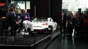
Q: At the NY Auto Show this week Nissan unveiled a 50th Anniversary 370Z that paid tribute to your BRE Datsun race cars. What do you think of that?


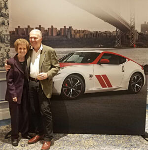
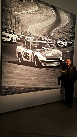
A: I was over the moon when Nissan contacted us last year saying they wanted to pay tribute to the legacy of the BRE Datsun 240Z’s racing successes with a special limited edition 50th Anniversary Z.  We have wanted Nissan to leverage our racing history for years as it adds long-term credibility to their engineering prowess.  This special run of 50th anniversary Z cars with BRE inspired livery, is the highest honor Nissan could make to BRE.

Nissan 370z

Peter with Z timelineZ timeline

Q: There has been some criticism online about the 50th Anniversary 370Z saying this design is getting outdated and there should have been a brand new design for 2020 to honor their 50th and that the livery homage to BRE is too minimal with just partial stripes and a red top with white sides.


A: Nissan doesn’t have a new generation Z for 2020 and they could have decided not to do something special for their 50th Anniversary, but that would have been a real disappointment to anyone who has owned any iteration of the Z car in this past fifty years. Not to recognize this milestone with BRE simply because they didn’t have a new Z car would ignore the value of their accomplishments and the fact that the current 370Z has been a solid car with good sales encouraging the car’s retention. Even though I have to agree the 370Z may have been around longer than anyone expected I’m still extremely happy they didn’t go that way and wait. Instead, Nissan embraced their winning heritage using BRE’s success with the first Z car as the focal point of their 50th anniversary.

When I first saw the draft images of the special edition livery I must admit I thought the design wasn’t quite bold enough to echo the BRE “look”. But those of us who focus on racing have to realize we sometimes don’t think about the considerations car manufacturers have to work within. If the car is intended to be driven on the street, it can’t be a full-on recreation of the BRE livery. That would just be too bold. I made that same decision when we created our own BRE Tribute 240Z. Instead of the red, white and blue BRE livery we made it a more subtle, street friendly, silver and white. Nissan’s design achieves the same purpose.

Q: What was it like being in NY for the unveiling of this car?


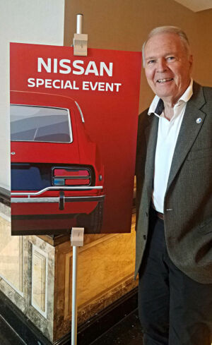
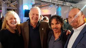
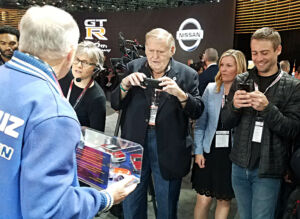
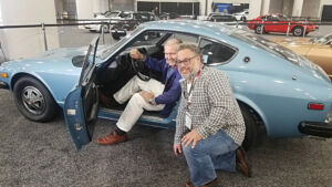
A: It was an amazing week. Nissan really rolled out the red carpet for us and they included special people like Johnnie Gable (Mr. K's longtime secretary). Other special attendees were Mad Mike, John Oates (a big GTR fan), and Tony Walker. There were special events every evening and they paid special attention to every logistic from first thing in the morning ‘till they limo’d us back to the hotel in the evening.

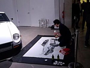
Nissan decided to offer a special poster marking the event and then embraced my idea of using illustrative art like I did originally at BRE for the 240Z when we won the SCCA National Championships in ’70 and ’71.  I chose to use the Austrian automotive artist Klaus Wagger as I especially like his work and only had to provide minimum art direction as he seemed to know exactly what I wanted from a couple of telephone conversations. He did a spectacular job for us.  Gayle did the final layout positioning the 50th anniversary text prominently to frame the art.   It’s a real collector’s item!

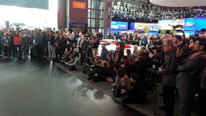
Then, what an honor to be invited to speak at Nissan's opening press event at the show. Hundreds of media people attended and amazingly hundreds remained to get a signed poster (thereby missing other manufacturers’ press events by doing so!).

The special edition 50th Anniversary 370Z is a special honor for BRE and the week where it was presented in New York I will always remember fondly.